5 Examples of Minimal Billboard Advertising
When it comes to effective billboard advertising, less is always more. Billboards typically have a very short time frame to grab potential customers’ attention. This makes minimal design a useful tool for attracting an audience.
Here are some inspiring examples that take minimalist design to a whole new level.
McDonald’s– 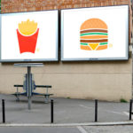
This billboard ad campaign uses only simple vector images to get its message across. It really shows the marketing power of the McDonald’s brand as it is instantly recognizable from the colors and style alone.
Chipotle- The brand does the exact opposite of the previous billboard by adding only words to the design. However, it works to the same effect. The ad uniquely applies contrast to highlight the most important information in a way that is fun and creative.
iPad Mini– 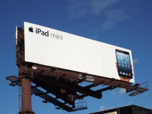
Apple is known for their robust campaigns that feature amazing high quality photography. However, in this campaign for the iPad Mini, they skillfully stepped back and let the product itself do the talking.
Snapchat- 
The popular social media platform took to outdoor advertising in 2016 with these simple, yet iconic billboard ads. Again, they found that their logo alone was appropriate for crafting their message.
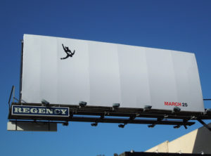
You might just miss the small amount of imagery featured on this billboard for season 5 of the popular AMC series Mad Men. This billboard gets points simply for the pure curiosity that it invokes. It proves that a great idea can be simple and break all the rules.
What are your favorite examples?
Let us help you get the best designs on your prints! Contact us for a free quote.


